
Christof John
March 1 – April 29, 2022


Our eye is a paradoxical sensory organ. On one hand, it grants us a whole field of simultaneous sensations, for which the sensory cells of our retina are responsible. On the other hand, our eye muscle constantly moves to direct the eye towards the focus point of most intense perception at the center of the retina, from which we expect particular enlightenment. Consequently, our brain has to cope with a continuous change of retinal impressions and seek insights in this change.
When viewing a painting, a clearly defined surface, both aspects are particularly challenged. Various visual markers stand out on the surface. If we try to get an overview, we focus on the ability of our vision to simultaneously evaluate all retinal information. However, if we want to know more precisely the relationships between individual visual markers, we move our eye muscle and direct the center of the retina to our point of interest. In an artistic painting, visual markers are placed in a complex relationship through a sometimes long process of decision-making and weighing: how, with which means, which color is applied at which place in the picture, and how it is adjusted to the other colors is continually altered during the artistic process of creating the painting. The viewer’s eye is then called upon to decipher from the finished painting the decisions made in the setting of these visual markers. Every artist is aware of the task they entrust to their viewer with certain paintings.
In modern painting, this process of perception and the responsibility regarding the appropriate visual reconstructions has increasingly become the subject of the paintings themselves. This can go so far that everything in the picture is put to the test.
Christof John’s paintings challenge both aspects. Can I look at them correctly, can I adequately recognize their visual complexity, and at the same time understand what they aim to establish as a new understanding of ‘correct’ painting?
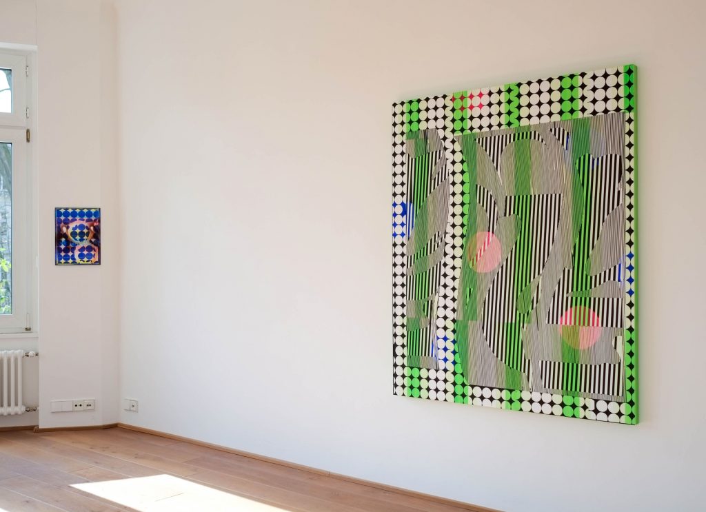
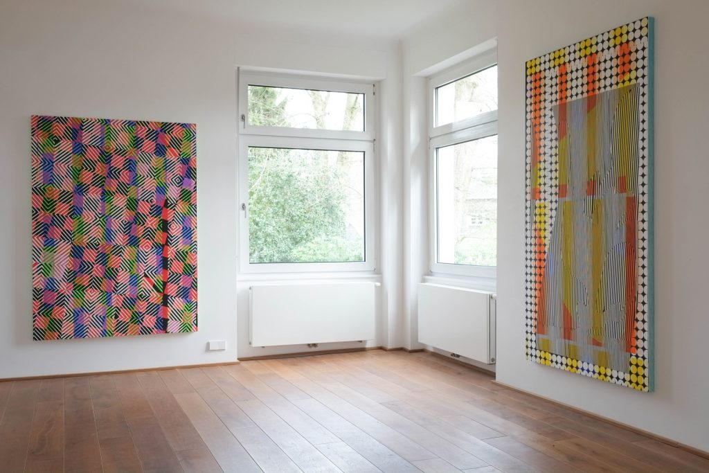
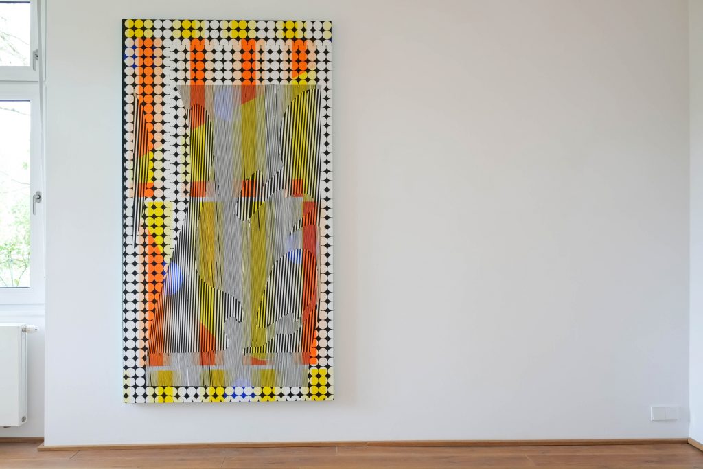
John names his exhibition in Wuppertal “Parallaxis.” Parallax means that we see with two eyes and, due to the distance between them, receive two slightly different images. From its original Greek meaning, it implies an exchange or alteration. Looking at Christof John’s paintings means being confronted with an immediate shift between geometric structures and colors. His paintings are precise, yet also blurred and intentionally flawed. They are interspersed with geometric elements that contrast with organically soft, delicate color fields. Their recurring geometric structures, grids, and lattices appear extroverted, evoking something of the artificial configuration of the world by humans, such as architecture or the line systems of our infrastructure from a bird’s-eye view. In contrast, the delicate, fine painting style exudes something introverted.
However, these two poles do not provide a clear access to perception because they are not homogeneous in themselves. Neither the soft color fields nor the geometric elements form a coherent whole. An observer unfamiliar with the paintings might speculate that the breaks in the images arose from a collage principle, that material from different graphical contexts had been taken and glued together. This assumption is based on the experience that the paintings undermine every claim of painting to a constant homogeneous surface, to consistent linearity, to a coherence of colors, thus fundamentally questioning painting as a medium. Upon closer inspection, however, it turns out that John’s painting itself creates these breaks and reversals, that form and color exist on the same pictorial plane, even if they cannot be perceived as coherent.
John restricts the readability of lines and image contours by repetition and simultaneous variation, alteration in repetition—this distinguishes him from Op-Art. He undermines the readability of the painterly surfaces through the delicacy and varying strokes of his painting. In dealing with the initially dominant geometric clusters, the color fields are perceived as a background phenomenon, creating layers of transparency in the images so that the colors are perceived as different layers of veils, their effectiveness depending on the perceptual context established by our eyes. Additionally, John undermines the placement of color because he allows it to appear not only on the image surface but also at the edge of the image carrier. In many images, he suggests a very thin, fragile smooth image surface by a narrow side edge, which is countered by a more robust, thicker, and coarser image carrier of a different color at the side, thus disrupting the color impulses of the foreground surface.
Thus, in the course of the arduous process of perceiving his paintings, it turns out that no uniform plane exists and even the two categories of color field and form cannot be clearly distinguished. This impression is reinforced by another central construction principle of the paintings in the form of different types of motion impulses, which the perception is prompted to by the visual constellation of the paintings.
A line is the connection between two points. It makes a difference which point the eye uses as a starting point and how it is guided through the course of the line to its own movement. A grid forms a homogeneous field of units. However, when it is intersected by line elements, the homogeneity disappears, and areas that stand out more prominently than others are formed because the line guidance stimulates the eye to glide through the homogeneous field differently. When color fields or color bands are added to this field, the inequalities intensify, so that one can sometimes feel ‘crevasses’ breaking open in the picture surface. John knows how to set up and explore all these moments of irritation. Even with the greatest effort, the viewer fails to keep all the components clearly separate, because his stationary, registering vision is immediately drawn into a motion spell, resulting in incessant, restless vision.
John works with elementary geometric pieces such as triangles, circles, squares. They are like a letter material that occurs in multiples, but does not seem to come together to form new figures or words. In contrast with other geometric elements and in the overlapping of color fields, pictorial figures seem to emerge suggestively. If one thinks one has found a reading, it is not stable but can disintegrate at any time because a different visual contact can establish another reading.
In the alternation of advancing, emerging, and receding, withdrawing, the veils of color play their own game. Often it is not even possible to determine which color is dominant because, depending on the reading, sometimes one veil and sometimes another promotes a color as the more present. These color veils each bind certain geometric shapes, so that the form and color settings are in a constant conflict. Since John applies his paint lightly and almost transparently, the eye is facilitated to constantly reorganize. Depending on the distance and viewing angle to the picture, the weight of each color changes.
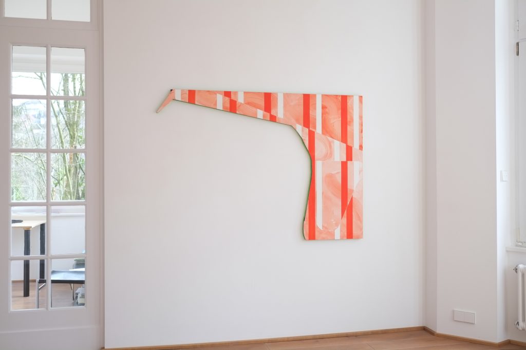
John uses slight deviations from orthogonality and roundings as suggestions of displacement. The viewer continuously struggles with themselves to determine where the correct standpoint is and where the pivot point in the picture is. But not only the manifold relationships in the graphic arrangement, also the ductus of the paint, which appears homogeneous from afar but shows its painted ductus up close, adds an additional motion drive to the picture. The hardness of the geometric linear form is answered by an organically gentle flow, and this flow allies itself with small errors in the graphic forms, which thereby leave their mechanically repetitive norm.
John uses sharply etched contour lines as hard contrast moments, where the brightness contrast of black and white breaks. The eye is inclined to first follow their movement guidelines. These lines are not only straight but also rounded, leading the eye to two different speeds.
The human upright gait requires a constant rapid adjustment of the vertical and horizontal. For diagonally oriented lines, we take longer to assess their positions. Additionally, John’s paintings sometimes give their outer edges a unique shape instead of right angles, resulting in another speed directive for seeing. Since outer edges are registered by the eye faster than internal contour lines, such images offer further possibilities for differentiation.
There are also differences in the speed of paint application depending on how fluid it is, introducing other speed components into the painting process through painting. If we consider that every hand-painted image also tells something about the qualities of application and the subjective moods of its painting, it becomes apparent that in the juxtaposition of geometric speeds and painting speeds and styles, John’s paintings engage in a discourse about painting. An initial superficial view might suggest that the theme of the images is a discussion about the possibilities of seeing with its moments of irritation, but reflecting on the subjective components of the images reveals that the theme lies in the question of the possibilities of painting itself. This is also evident from the fact that the often rounded contour progressions are not just references to geometric circular shapes, but also to circular painting movements of the hand in a steady back and forth, and that the optical formation of several parallel black lines can be read like a soft modeling movement of the hairs of a large brush, think here of the painting simulations using graphic comic forms by Lichtenstein.
The movement shifts are also the reason why an inexplicable spatiality arises from the flatness of a geometric arrangement. The painting process for geometric surfaces with hard contours requires a layered application through alternating covering of already painted surfaces. As structures overlap, the eye tries to decide which is in front and which is behind. John’s thinly painted surfaces give no clue. When a geometric formation is read as a figure, it appears in the foreground and gains a bodily reference, although no shadows model a volume. When various veils of color are added, a free color corporeality develops.
John’s paintings at first glance suggest technically perfect image mechanics, but upon closer inspection, numerous intentional errors become apparent, which he deliberately incorporates and seeks in his painting to derive the reversals in his painting not from construction but from experience with attitude adjustments. The errors not only make the non-mechanical nature of painting obvious but also the dialogic nature of the painting process in its self-inquiry.
As part of his painting materials, John also lists the pencil, which in its fine lines can tell the specifications and deviations from the original plan, thus providing clues to changed considerations and reflections in the painting process. The delicate element of pencil lines and the thin application of paint refer to the dialogic in his painting, which stands not for conceptual systematics, but for the gesture of physicality. This brings the viewer close to the image and allows something other than the chain of constructions and deconstructions, which are experienced at a distance, to resonate.
Despite their striking optical effect, John’s paintings are not monumental but remain bound to a bodily measure, as evidenced by the formats. Thus, despite the optical failure of clear interpretations, the human body remains the instance that leads the dialogue about the correctness of such images through a continuously renewed process of approximation.
Why are John’s paintings created? Has the influence of negativity in our contemporary world become predominant, must even the interpretation of our images fail? John’s paintings work with the experience that structural processes in our world become autonomous. At the same time, however, there are reversals in the images that do not arise from a plan but hint at the possibilities of other perceptual sensitivities and, if we grasp them, lead to astonishing extensions in our physical understanding. In the sequence of visual deconstructions, the development of possibilities within the framework of our efforts towards our physical integrity is our only salvation. It is crucial that the alienation over the omnipotence of the apparently relinquished neither leads to despair nor to a blinding hubris. The seemingly unattainable is not on the horizon of a complete beyond, but must be continually brought back into our horizon, or to our boundaries, as something elusive.
Rolf Hengesbach